Appearance
UnityPredict Analytics Dashboard
The Basics
The dashboard within UnityPredict provides a comprehensive overview of earnings, expenditures, and usage statistics for various models. The primary purpose of this interface is to empower users to effectively monitor the activity and performance of their models across various accounts.
To access the Dashboard page in UnityPredict, log in to UnityPredict Console and navigate to the Dashboard from the sidebar.
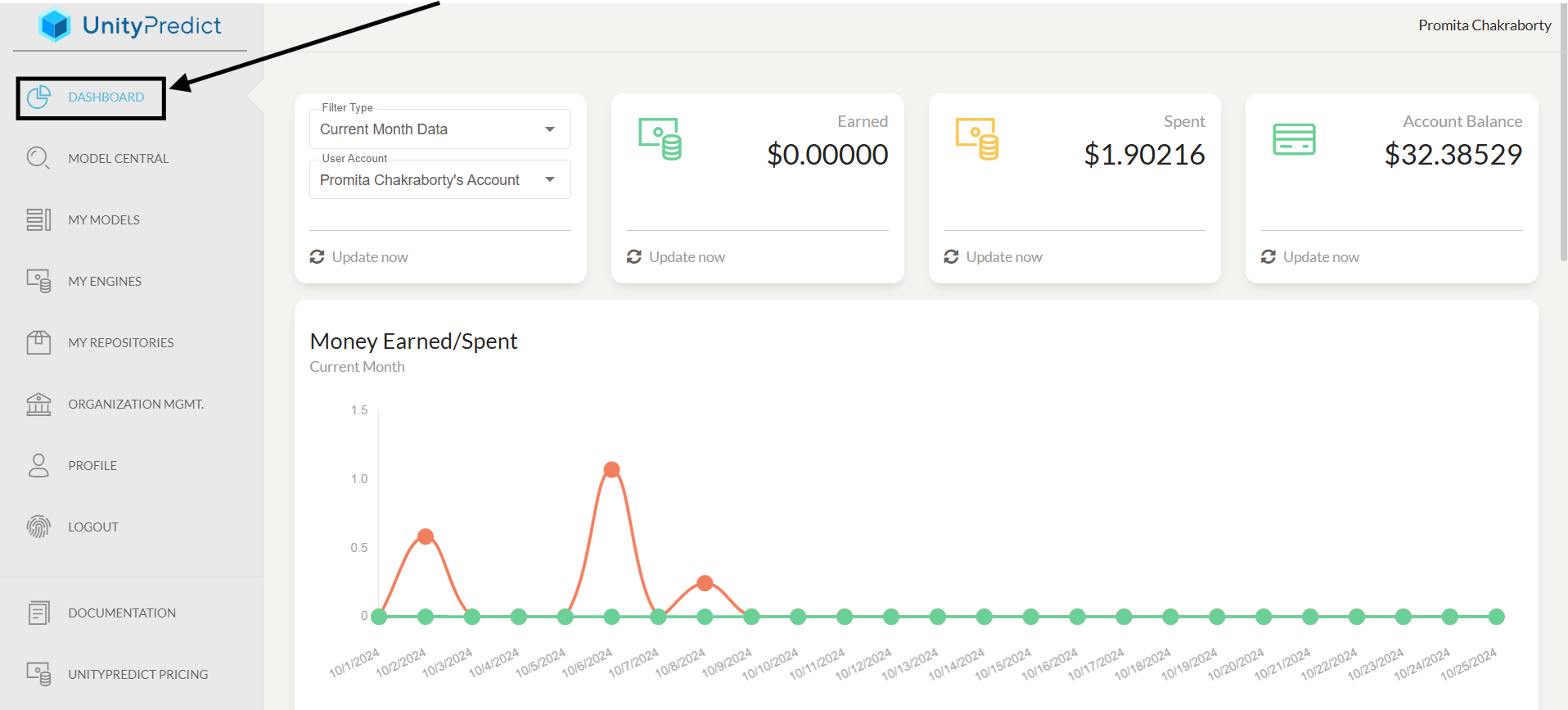
The top left card in the dashboard provides two filters.
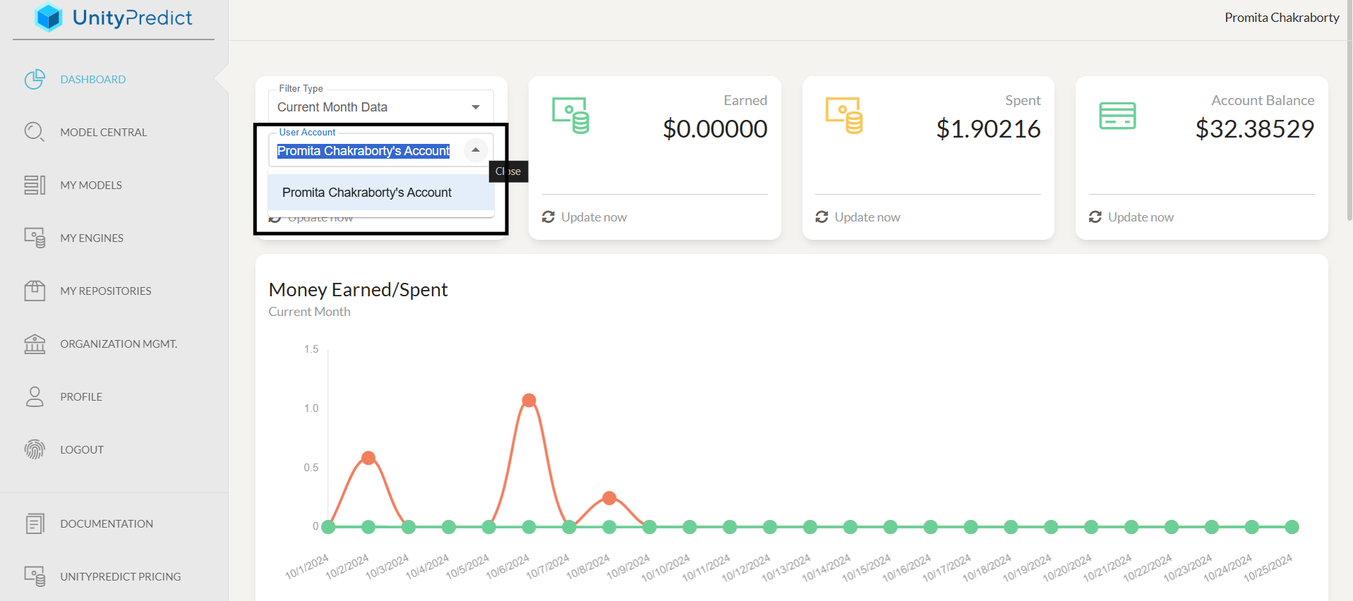
- The Account drop-down allows user to view the analytics for a particular account.
- The Filter Type drop-down allows users to select a time period for the displayed analytics. You can select
Current Month (daily)analytics vs.Current Year (monthly)analytics. Note: Changing this filters impacts all cards in the dashboard, except theAccount Balancewhich always shows the latest account balance for the selected account.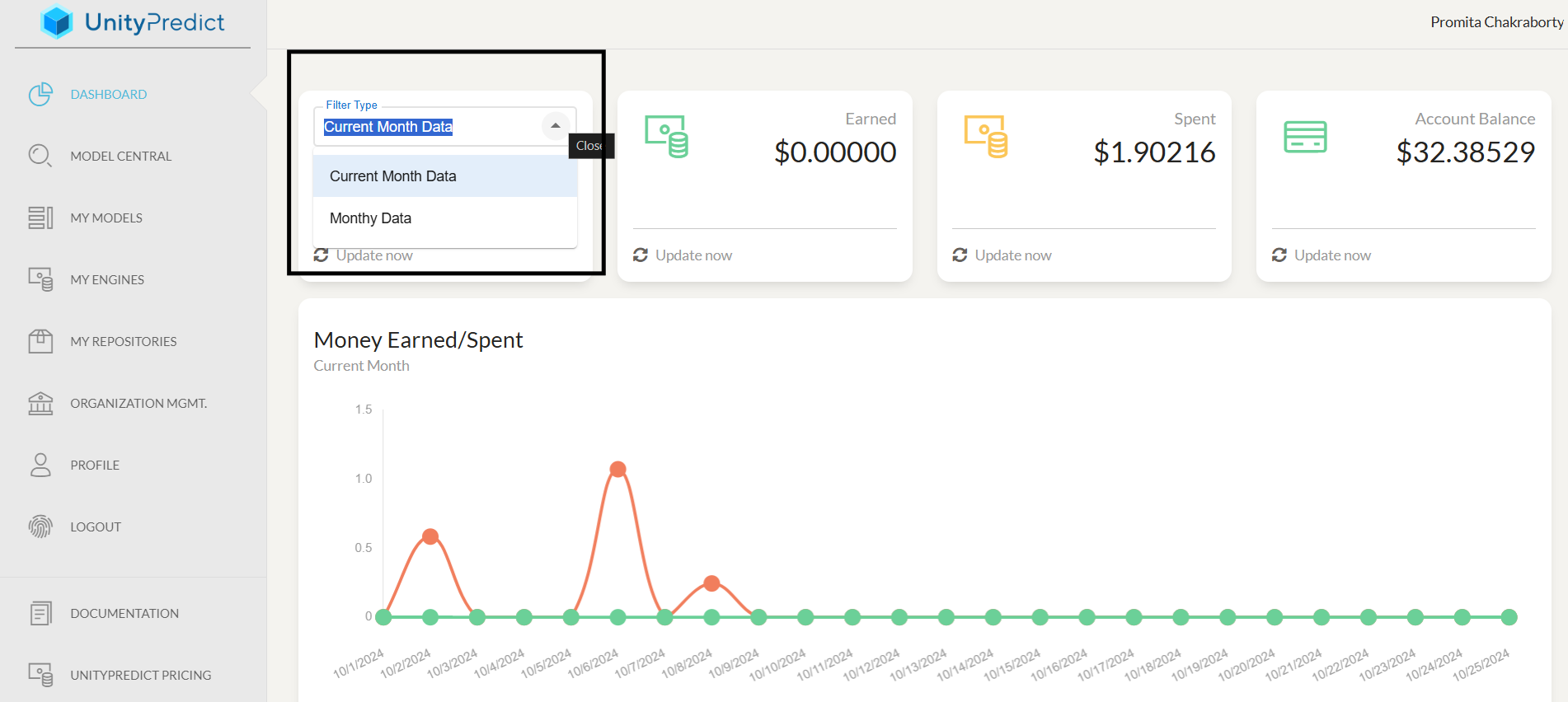
Account Summary
The Account Summary cards display basics information about the selected account, aggregated based on the selected time period.
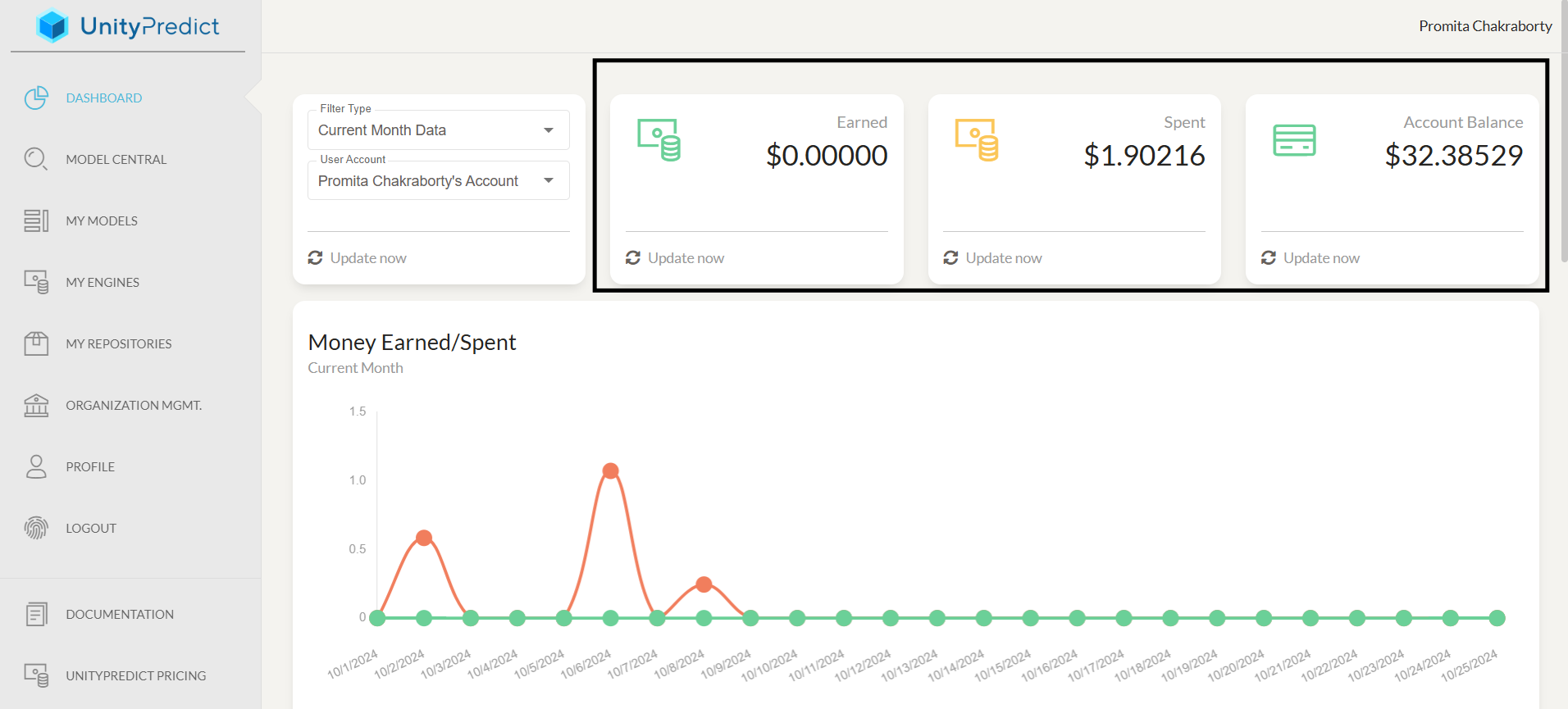
Earned:Total earnings for the selected account & time period.Spent:Total expenditure for the selected account & time period.Account Balance:The current balance in the selected account reflects the available funds for accessing models and other platform services.
Each card have a features of Update Now button to trigger manual data refresh.
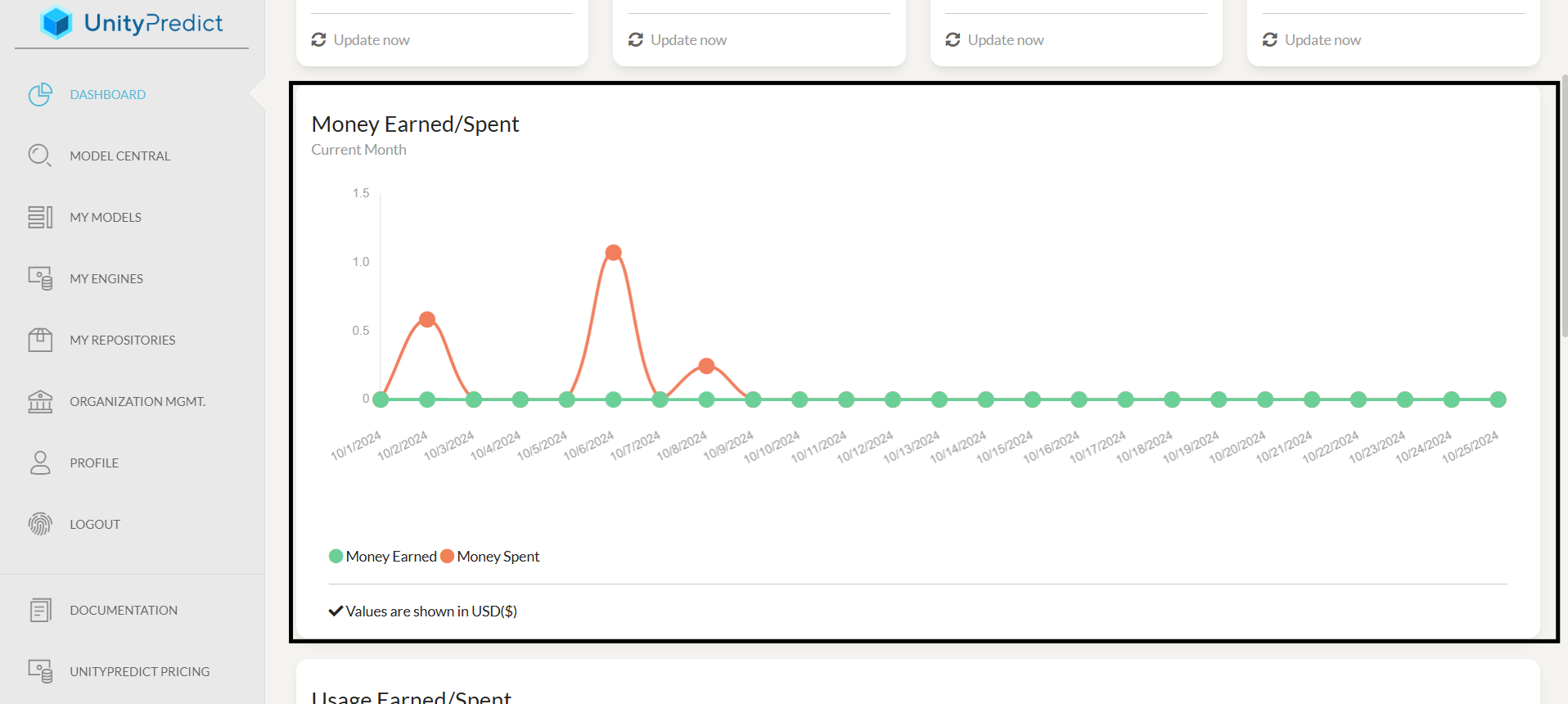
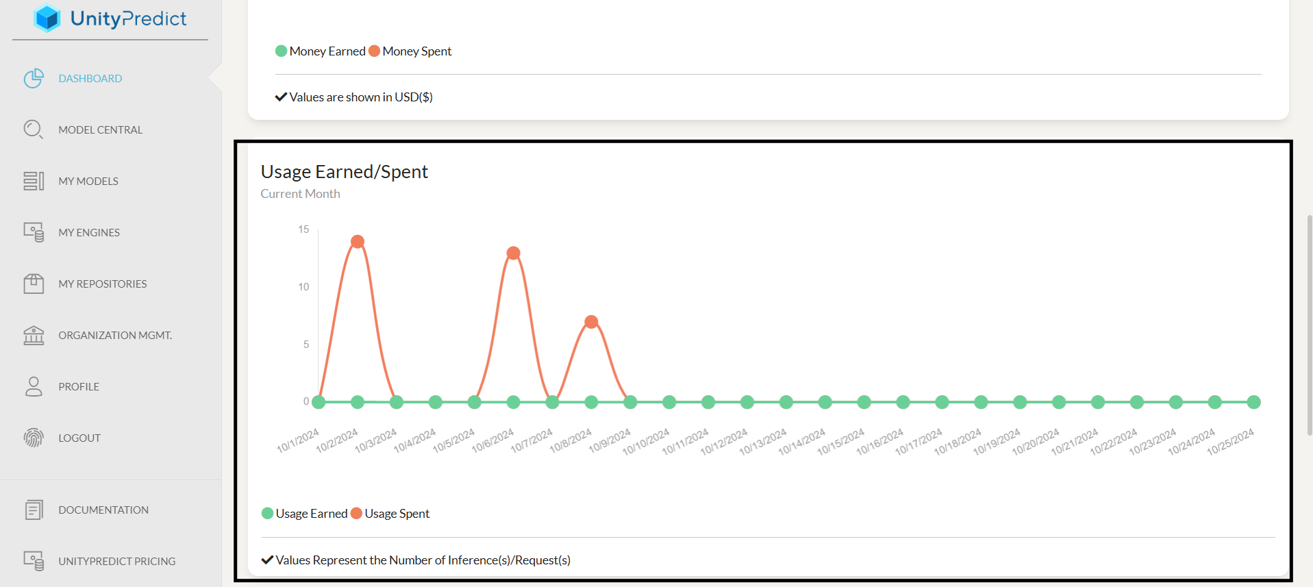
High-Level Analytics Plots
The analytics plots provide more detailed breakdown of earning and expenditures across the selected account and time period.
Money Earned/Spent Graph : This section offers a graphical representation of your financial activities within the specified time frame, illustrating the amounts earned (shown in green) and spent (shown in orange) on various dates.
Usage Earned/Spent Graph : This section offer a graphical representation of the number of inferences performed on the models associated with the selected account, over the selected time period. The green line represents inferences performed by models owned by the account and orange represents inferences consumed by this account on third-party models.
Per-Model Earnings/Consumption
This section of the dashboard offers insights into the utilization and financial performance of individual AI models on the platform, allowing users to track revenue generation, usage extent, and associated expenditures.
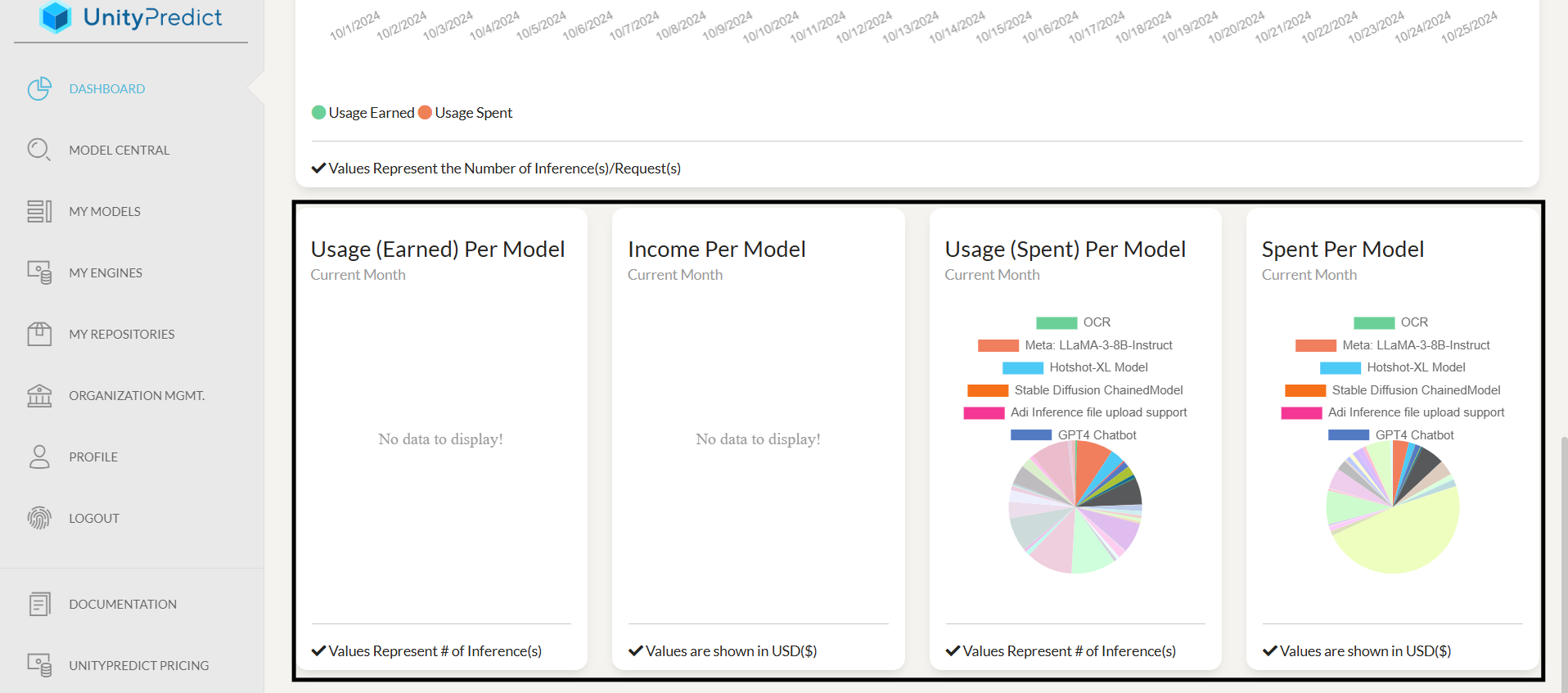
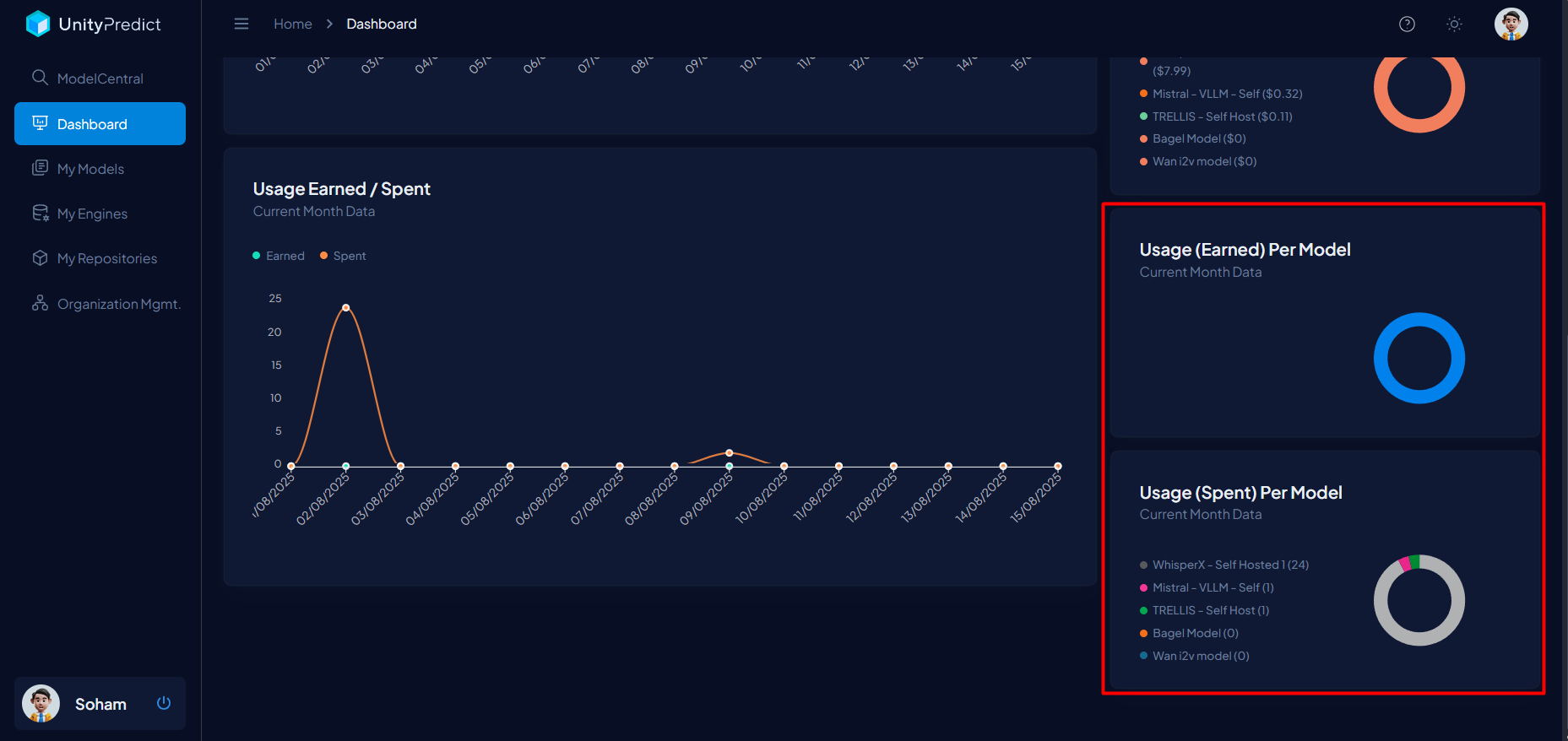
A. Usage (Earned) Per Model: This report card shows the usage of models owned by selected account, measured in requests (aka. inference count). If "No Data to Display" appears, it indicates no earned usage for any model.
B. Income Per Model: This card monitors the income generated by each model owned by the selected account, for the selected period. "No Data to Display" indicates no income has been generated. Values are shown in USD.
C. Usage (Spent) Per Model: This card shows the the number of inferences of third-party models performed by the selected account, within the specified time frame. A pie chart visually represents usage distribution among different models, with a color key for easy identification.
D. Spent Per Model: This card reflects the actual monetary expenditure on each model for the specified time frame, displayed in USD. A pie chart illustrates the financial breakdown for each model, helping users manage costs effectively.